Teaching
As a former high school English teacher, I bring a unique perspective to the field of UX design. While teaching, the students were my “users,” and they experienced the lessons I designed and delivered every day. My main goal was to optimize the user experiences of my students so they were engaged and progressing in their studies. I taught ~175 students per year. My interactions with diverse students, some of whom had disabilities or were non-native English speakers, lead me to emphasize accessibility and consistency in everything I design – from lesson plans and school projects to mobile apps and websites.
My eclectic background has given me many valuable transferrable skills, and I am confident in (and excited about!) my ability to create meaningful and impactful designs that will improve users’ lives.
See below for some of the experiences I designed for students that highlight UX principles particularly well.
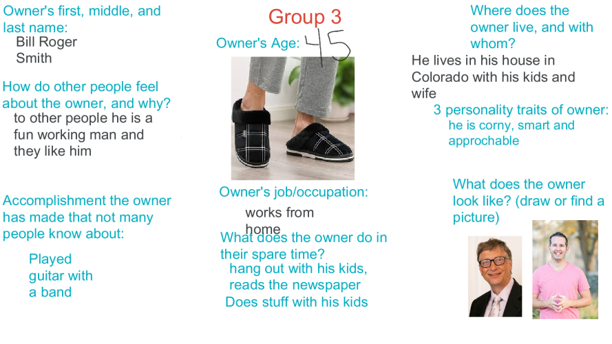
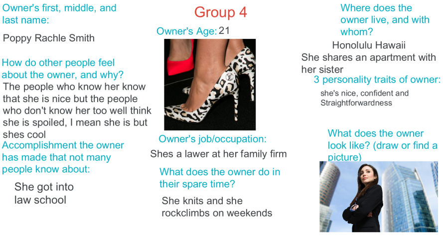
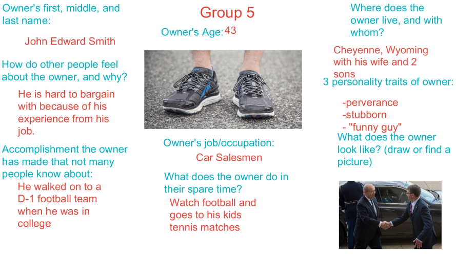
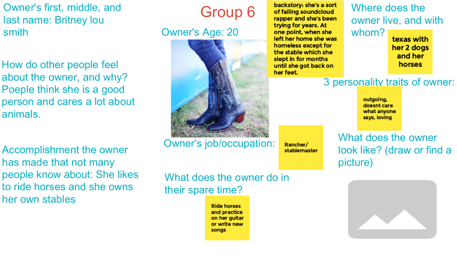
Walking in Someone Else's Shoes
Activity based on Harper Lee’s To Kill a Mockingbird
Context
- Class Name: 9th Grade English I
- Class Format: Virtually via Google Meet
- School year: 2020-2021
- Class Demographics: 13-14 year olds, including some students with disabilities.
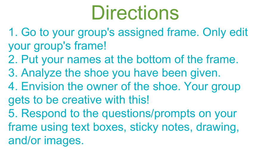
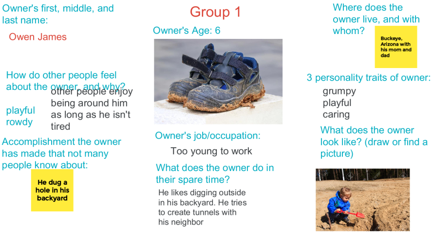
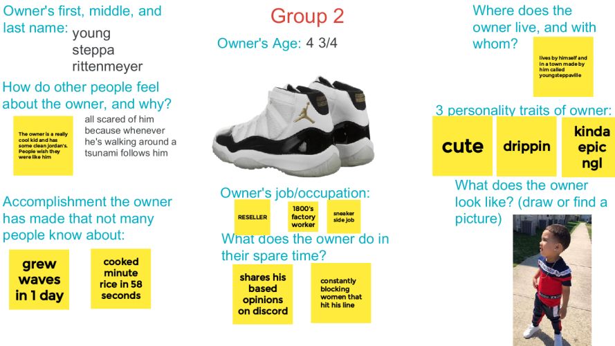
- Artifact: The Google Jamboard below was a small group activity we did to explore the following quote from To Kill a Mockingbird: “You never really understand a person until you consider things from his point of view… until you climb into his skin and walk around in it.” – Atticus Finch (chapter 3)
UX Considerations
- Students worked together in small groups to create user personas based on an image of a pair of shoes
- Google Jamboard’s interactive nature encourages collaboration and ideation among students
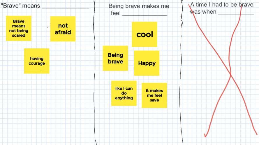
Brave Space
Context
- Class Name: 9th Grade Sheltered English I
- Class Format: Virtually via Google Meet
- School year: 2020-2021
- Class Demographics: 13-14 year olds, all of whom were non-native English speakers. Many had been in the US for less than a year.
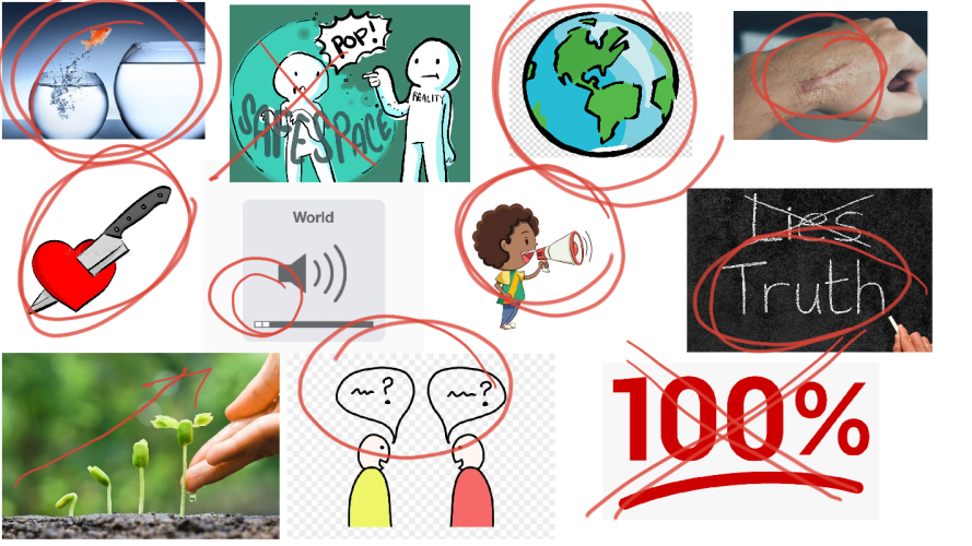
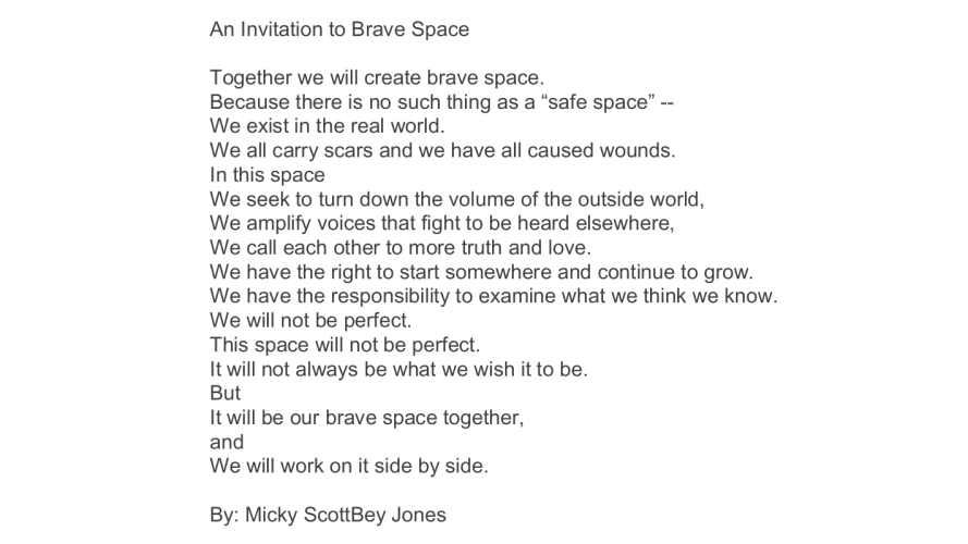
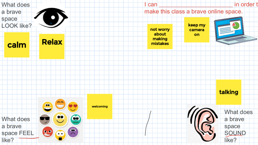
- Artifact: The Google Jamboard below was an activity we did on the 1st day of school to establish norms for our virtual classroom environment
UX Considerations
- Multi-lingual
- Images help convey concepts visually
- Google Jamboard’s interactive nature encourages collaboration and ideation among students and teacher

Romeo & Juliet Class Slides
Context
- Class Name: 9th Grade Sheltered English I
- Class Format: Virtually via Google Meet
- School year: 2020-2021
- Class Demographics: 13-14 year olds, all of whom were non-native English speakers. Many had been in the US for less than a year.
- Artifact: The Google Slides below were our ongoing class slides that I used to structure our study of Shakespeare’s Romeo & Juliet
UX Considerations
- Taught an abridged, lower-lexile version of Romeo & Juliet specifically made for the user group (non-native English speakers)
- Images and animations help tell the story and explain literary concepts
- Each character was assigned a clipart cartoon character that remained consistent for the duration of the play
- Large font
- Bolded keywords
If the Google Slides preview below does not load, please use this link: Romeo & Juliet Class Slides. Be sure to click the “Slideshow” button in the top right corner to view the slides in presentation mode and see the animations.