Project overview
Challenge
Art museums need help keeping visitors engaged and interested.
“Art museums are a bit slow and boring.”
-Rebecca (survey participant)
“I haven’t been to [an] art museum since I was a kid. To be honest, I’m not sure if I have been to one in my local area.”
-Vince (survey participant)
Solution
Design an app that enhances the museum experience in an interactive way so users can learn more about artists.
Results
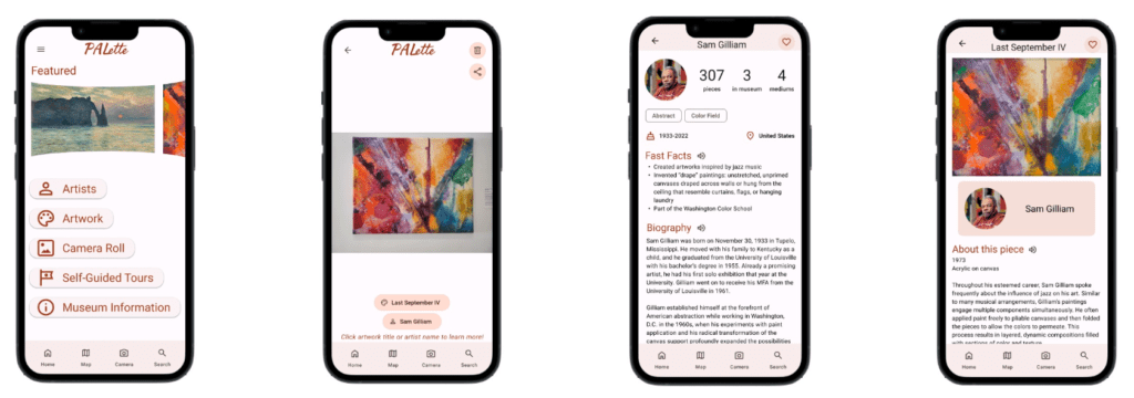
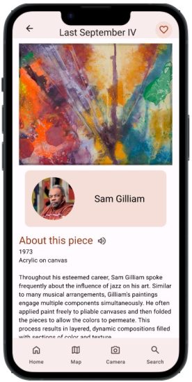
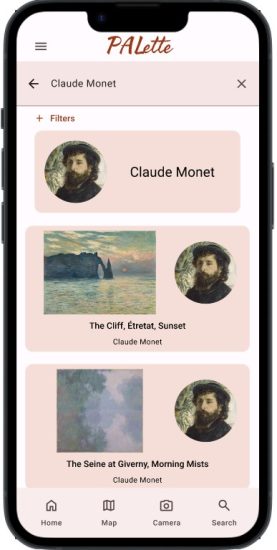
PALette: an artist bio app concept for the North Carolina Museum of Art (NCMA). The app augments the physical experience of being in an art gallery by providing engaging information about artists through a Google Lens-like fashion. Users can take a photo of an art piece and the app uses image recognition to direct the user to information about the artist and artwork.
My role/responsibilities
Role: Sole UX designer creating a mobile app from conception to delivery
Note: This was a personal project, not work completed for a client
- User research: surveys, user persona, user journey map, competitive audit, site visit, usability studies
- Paper and digital wireframing
- Low-fidelity and high-fidelity prototyping in Figma
User research
Survey says...
I conducted a user research survey among family and friends (sample size: 5) to discover more about people’s experiences with and attitudes toward art museums.
- 40% of respondents didn’t know if there was an art museum in their local area
- 80% of respondents have not been to an art museum in the past 3 years
- 60% of respondents said they would look an artist up online to learn more about them
User persona
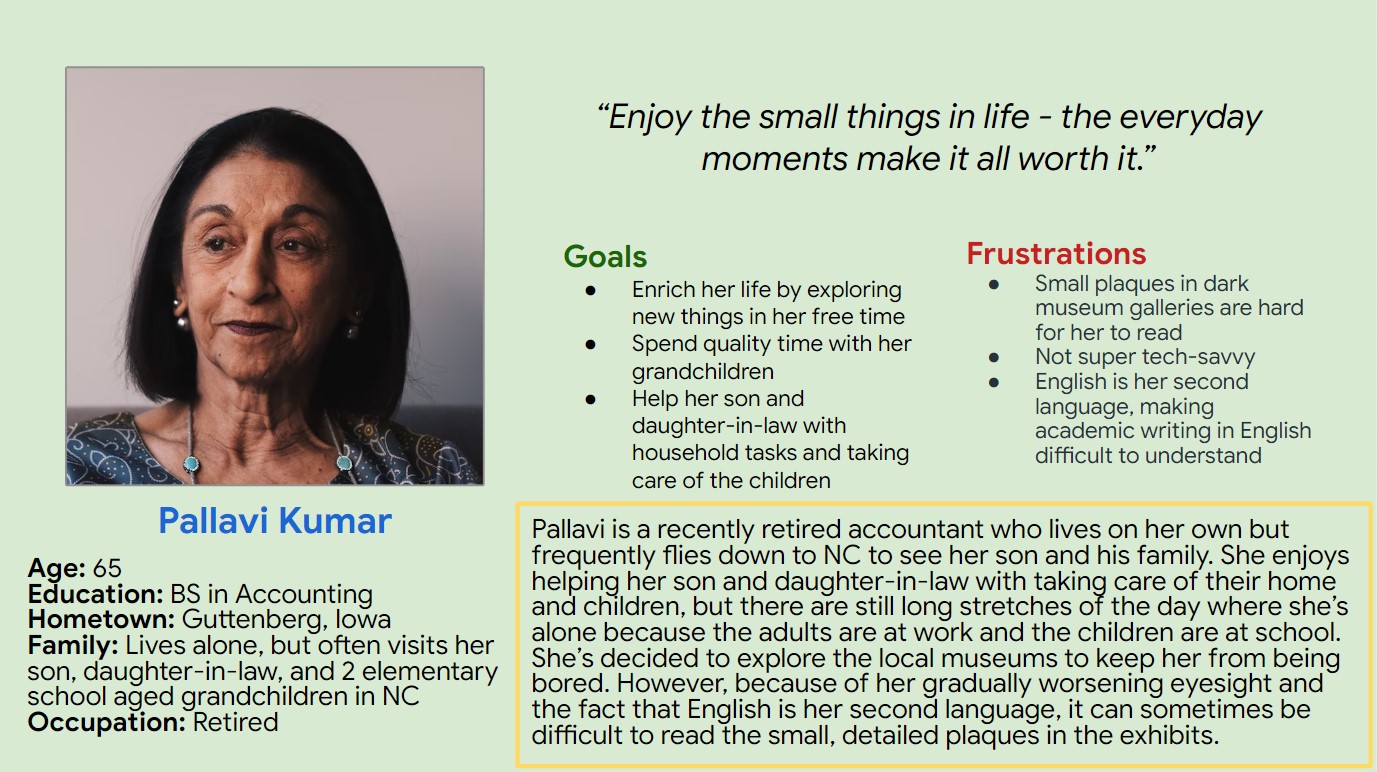
Retirees were a user group identified through the user survey results. The user persona Pallavi Kumar was created to reflect this user group.
Retirees, just like other user groups, want to learn, explore new things, and be entertained. However, they may encounter obstacles when visiting an art museum due to physical conditions such as hearing loss, worsening vision, and low dexterity. Ensuring the app is fully accessible to those with physical impairments will be an important consideration.
Additionally, older individuals may be less tech-savvy and would appreciate an easy-to-use app that includes step-by-step instructions.
Problem statement:
Pallavi Kumar is a recent retiree who needs an engaging, accessible way
to experience the local art museum because she wants to keep her mind sharp and prevent boredom.
User journey map
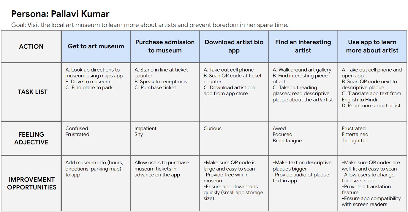
A successful experience using the artist bio app relies not only on the app itself, but also on the physical environment of the art gallery (lighting, QR code placement, etc.)
Competitive audit
I conducted a competitive audit of 3 different museum apps to compare the UX of each: Asian Art Museum SF, The San Diego Museum of Art, and the Orlando Science Center.
View the competitive audit spreadsheet and accompanying report.
The competitive audit highlighted several opportunities for PALette to address gaps in the current market by:
- Providing kid-friendly videos about artwork and/or descriptions that are written at a lower lexile level
- Making sure app is fully translatable into other languages
- Ensuring app is fully functional no matter what the user’s physical location is (i.e. not requiring user to visit the museum in person to experience the app)
Ideation
"How might we...?"
How might we remove the need to see for visitors at an art museum?
- Touch tours
- Audio tours*
- Match art pieces with songs (synesthesia)
- Create textured models of 2D art
How might we remove the need for QR codes for our app to work?
- Use the artwork as a “QR code” itself – scan the artwork to learn more about the artist*
- Use location provided by phone GPS to detect which piece someone is standing in front of
How might we remove the need to be physically in the museum to use the app?
- VR tours
- No QR codes
- Provide pictures of artwork in the app*
*Ideas with an asterisk are ones that made it into the final prototype
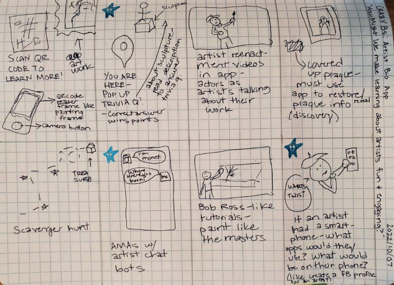
Crazy 8s
How might we make learning about artists fun and engaging?
Low-fidelity wireframes/prototypes
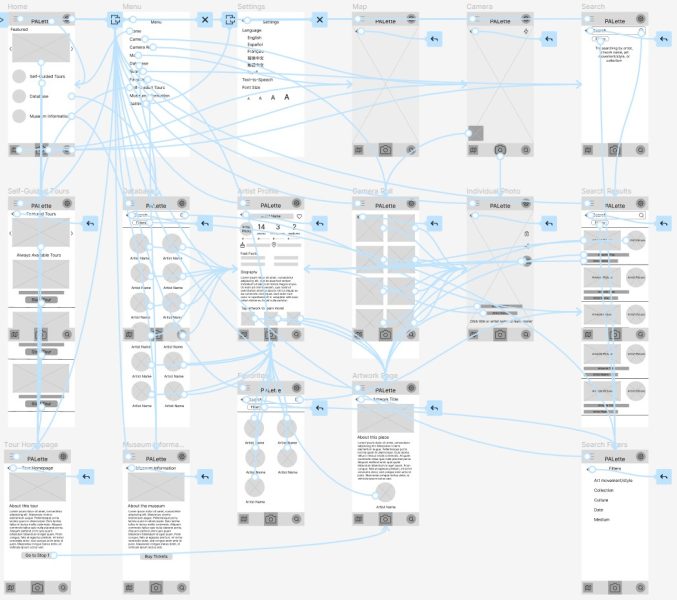
Sitemap
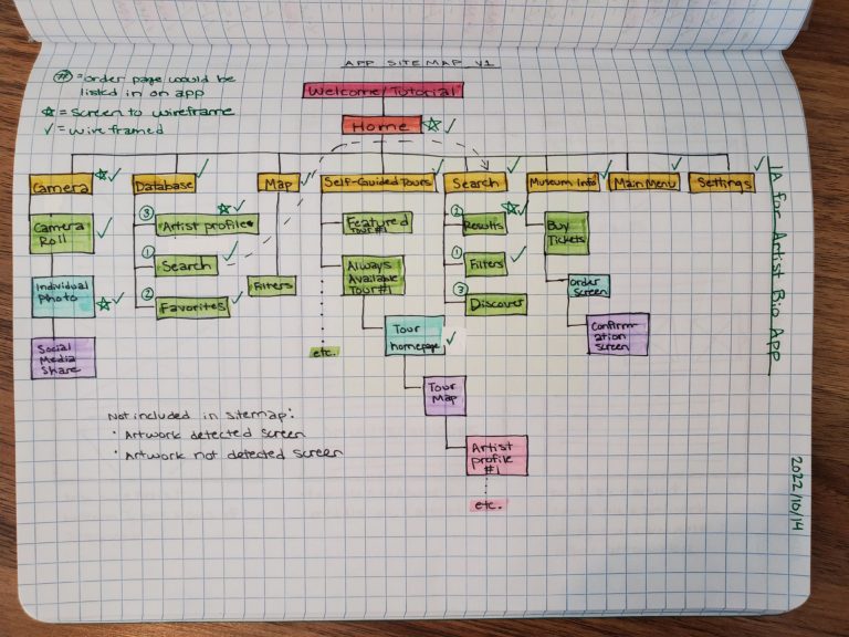
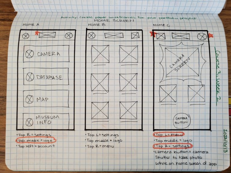
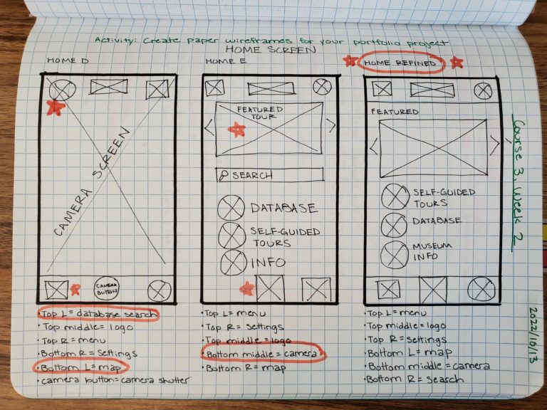
Paper wireframe iterations: home screen
Digital wireframe samples
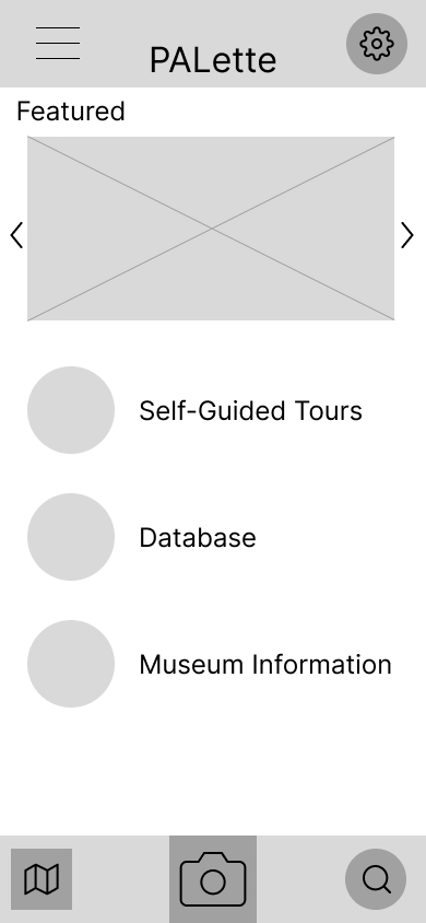
Home screen
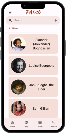
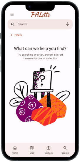
Simple design with a clean, uncluttered layout. Navigation bars on top and bottom displayed on every screen of the app.
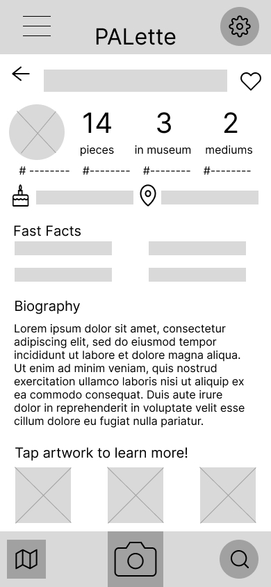
Artist profile screen
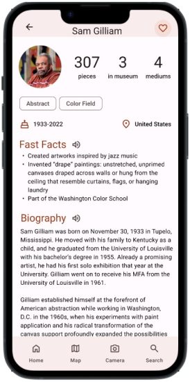
Instagram-style header is familiar to many users and provides quick information at a glance. Fast facts and detailed biography sections allow users to choose how in-depth they want to learn.
Low-fidelity prototype (draft 1)
Low-fidelity usability study
Research plan
Here’s the research plan for the low-fidelity prototype of PALette.
- Research goals: Figure out if users can complete the core tasks within the app (ex: taking a photo, learning more about artists and artwork, launching self-guided tours, etc.). Results of the research may provide insights on how to reduce complexity and streamline user flow.
- KPIs:
- Use of navigation vs. search: Which user flows are most popular when looking for information about an artist, and why?
- Time on task: How long does it take for a user to take a picture of an art piece and use that picture to navigate to the appropriate artist profile page in the app?
- System Usability Scale (SUS): Do users find the app intuitive and easy-to-use?
- Unmoderated usability study conducted remotely
- Tools: Google Forms and Maze
Affinity diagram
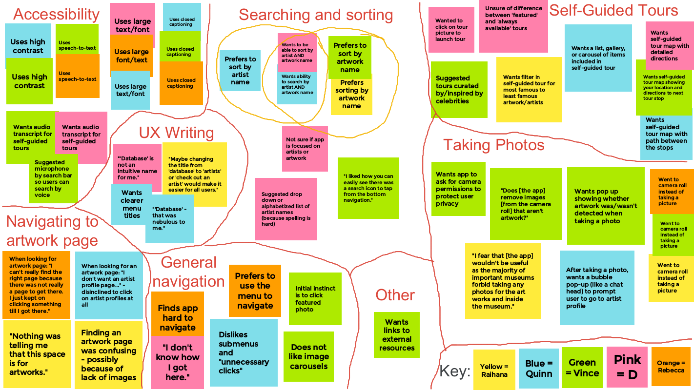
Findings and insights
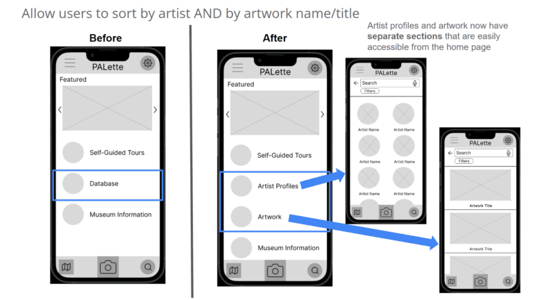
- More descriptive titles for pages are needed
- Ex: rename “database” to “artist profiles”
- Allow users to sort by artist name AND artwork title
- Sorting preference was evenly split between users
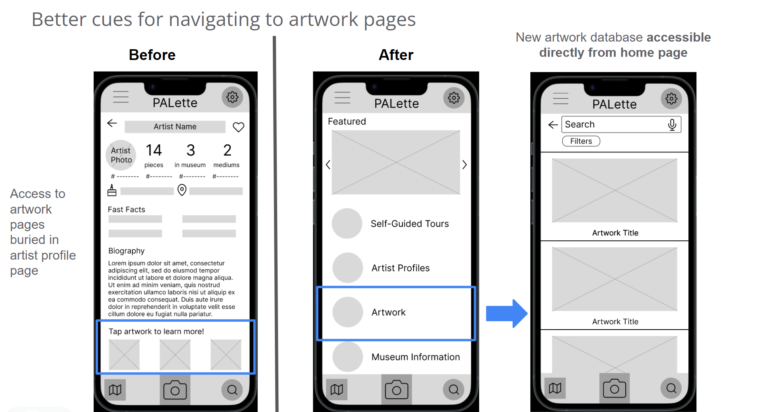
- Use a flat site hierarchy to improve ease of navigation
- It took an average of 42 seconds for users to find an artwork page
- User-requested features (added in low-fidelity prototype draft 2)
- Search by voice
- App permission requests (for access to camera/camera roll)
Low-fidelity prototype (draft 2)
Field trip!
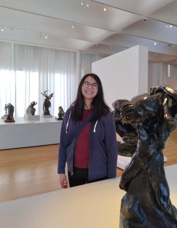
I took a site visit to the NCMA to take photos of art pieces to include in my high-fidelity designs. While there, I realized several of my assumptions about artists and their work were incorrect!
- Sometimes the artist of a piece is unknown
- Ex: “Kapsiki or Higi artists, Mandara mountain region, Cameroon”
- Sometimes the date a piece was created has to be approximated
- Ex: “circa 400-350 BCE”
In retrospect, I should’ve gone back and seriously revisited my artist bio app concept from the beginning:
- How do you write an artist bio for an artist that is unknown?
- My Instagram-style headers wouldn’t work for all art pieces!
But no, I kept going and narrowed my scope by only selecting artists and artworks that were well documented, which was quite limiting.
High-fidelity wireframes/prototypes
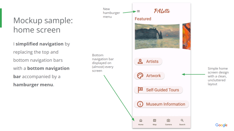
Mockup samples
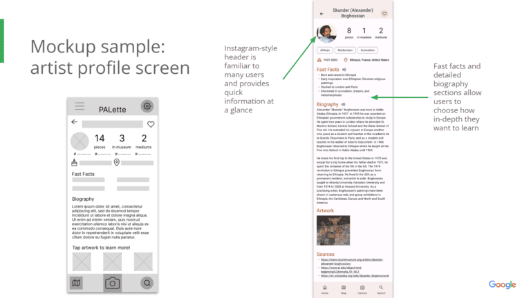
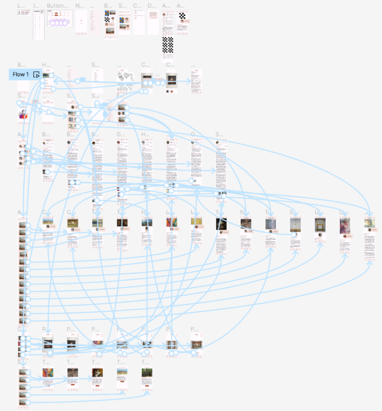
High-fidelity prototype (draft 1)
High-fidelity usability study
Research plan
Here’s the research plan for the high-fidelity prototype of PALette.
- Research goals: Figure out if users can complete the core tasks within the app (ex: taking a photo, learning more about artists and artwork, launching self-guided tours, etc.). Results of the research may provide insights on how to reduce complexity and streamline user flow.
- KPIs:
- Use of navigation vs. search: Which user flows are most popular when looking for information about an artist, and why?
- Time on task: How long does it take for a user to take a picture of an art piece and use that picture to navigate to the appropriate artist profile page in the app?
- System Usability Scale (SUS): Do users find the app intuitive and easy-to-use?
- Unmoderated usability study conducted remotely
- Tools: Google Forms and Maze
Affinity diagram
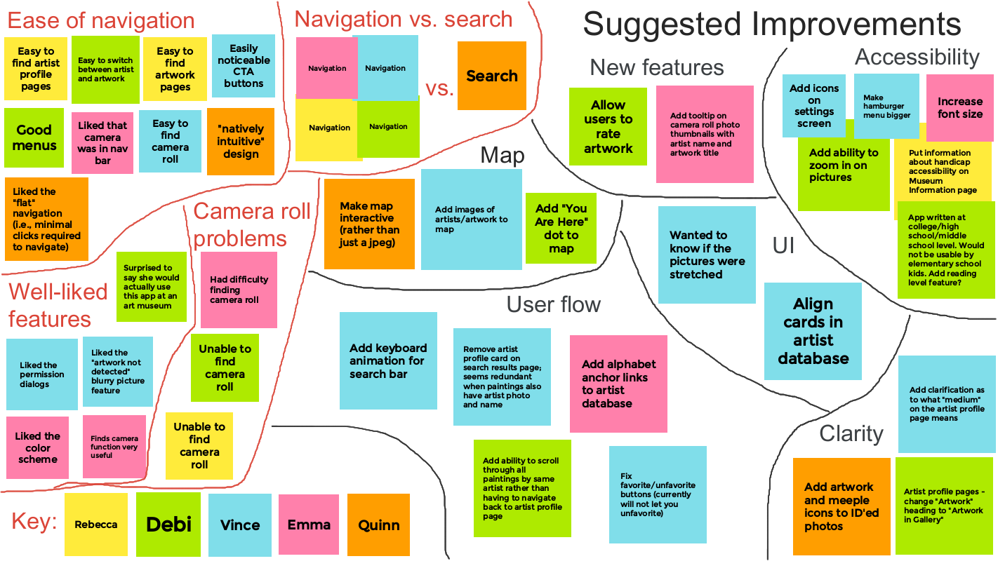
Findings and insights
- Overall, the app has an intuitive navigation system and user flow
- The camera roll is difficult for users to find
- Solution: I added a camera roll button on the home screen so users can quickly navigate to their saved photos
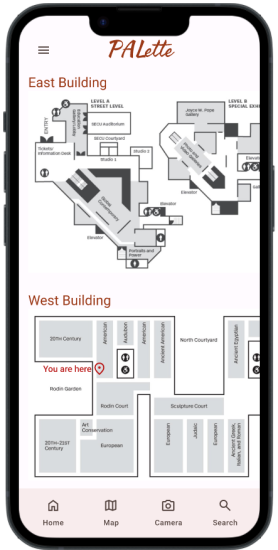
- Users would like a more interactive museum map
- Solution: I added a location icon labeled “You are here” on the map so users can view their current location as they move around the museum
Final high-fidelity prototype
Access the final high-fidelity prototype of PALette
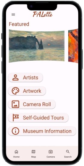
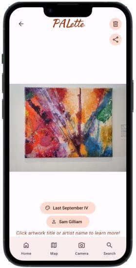

Accessibility
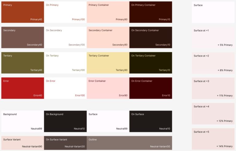
- Used Google’s Material Theme Builder plugin to create an accessible color palette that meets WCAG standards
- Included 6 different language settings and a text-to-speech feature to increase accessibility to written content
- Paired icons with written text to ensure clarity
Takeaways
Impact
PALette creates a more engaging and immersive visit to the art museum by utilizing image recognition technology to teach users about artists and their work.
“I think the application would be very useful in a museum context. I like how natively intuitive the design is.” -Quinn (usability study participant)
“I really liked the color scheme. I also liked all the different features! I think the camera function will be really useful.” -Emma (usability study participant)
What I learned
Artists cannot be separated from their art!
Initially, this was just going to be an app about artists… but I needed to include an artwork database, too! Additionally, sometimes things aren’t so obvious: sometimes the artist’s name was never recorded, or the date it was created is unclear. This turned my Instagram-style headers on the artist profile pages on their heads! I had to selectively choose artists whose names were known and whose art was well documented, which is quite limiting. Future updates to the app may include a complete overhaul of the artist profile pages.
Next steps
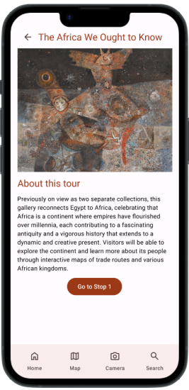
- Add multiple reading levels for text content to make the app more accessible to non-native English speakers and children
- Add more functionality to the map (ex: add dots that represent art pieces and show info about artwork/artist when tapped, integrate interactive maps in self-guided tours that show path users should take in the museum, etc.)
- Add a feature that allows users to rate an art piece from 1 to 5 stars and leave a review
Thanks for checking out PALette!
If you’d like to see more of my work or get in touch, you can find me on LinkedIn. Thanks again for your time!
-Samantha Gross
